10 Best FinTech Website Design Examples for Business Advantages in 2025
- TECHVIFY Team
- 0 Comments
Fintech has seen significant growth in recent years. Digital banking, money transfer services, and investment platforms are now widespread online.
While some brands maintain a physical presence, their websites are crucial for marketing and branding. Fintech websites do more than provide information; they serve as a vital service platform.
Websites often form customers’ first impressions. Thus, fintech companies need attractive, user-friendly designs that clearly present their offerings and build trust.
Here, we highlight the best fintech website design from recent years. These examples show how leading companies effectively engage their audiences through strong branding, usability, and trustworthiness.
I. What Makes Fintech Website Design Stand Out in 2025
Having an online presence is crucial for a financial tech company, but effectiveness matters more than mere existence. A top-notch fintech website should have:
Focus on User Design
A website should make users feel welcome and oriented. This involves a clean layout, easy navigation, and clear calls to action. It should also cater to mobile users, as nearly three-quarters of the global population will use mobile devices by 2023.
Clear Visual
A successful website is both visually appealing and easy to read. Avoid cluttered pages, confusing layouts, and hard-to-find information. Instead, employ a clear visual hierarchy to guide users through the content smoothly.
Maintaining Brand Consistency
Consistency is crucial for branding. Elements like the logo, color palette, tone of voice, and font choices must align to create a unified user experience. This applies to all pages, including landing pages, microsites, product pages, and blog pages.
Fintech website design
Creating a Clear Conversion Pathway
A great fintech website should be visually appealing and easy to navigate. Ensure visitors can move smoothly from one point to another with clear calls to action (CTAs) and defined pathways, such as signing up for a demo or downloading a white paper.
Providing Timely and Engaging Content
Content remains vital in the fintech sector. A top-tier website should feature excellent copywriting and content marketing efforts. This includes downloadable resources, blog posts, graphics, and videos. All content should be timely, targeted, and engaging to keep visitors on the site longer.
Ensuring Robust Security
Security is paramount when handling finances and customer data. A high-quality fintech website needs strong security protocols like two-factor authentication, HTTPS encryption, and GDPR compliance. If your site offers payment gateway integration, PCI-DSS compliance is also necessary to protect customers’ card data and secure transactions.
Implementing SEO Optimization
Search engine optimization (SEO) is essential for improving organic rankings and lead generation. Effective SEO practices include keyword research, metadata optimization, internal linking, and page speed optimization. Without good SEO, even the best website can go unnoticed.
See more FinTech insights:
II. 10 Inspirational Fintech Website Design Examples You Need to See
Now that we’ve explored the key elements of standout fintech websites, let’s dive into the top examples. Here are 10 of the most popular and successful fintech websites from 2024, highlighting what sets them apart from the competition:
1. Varo Bank
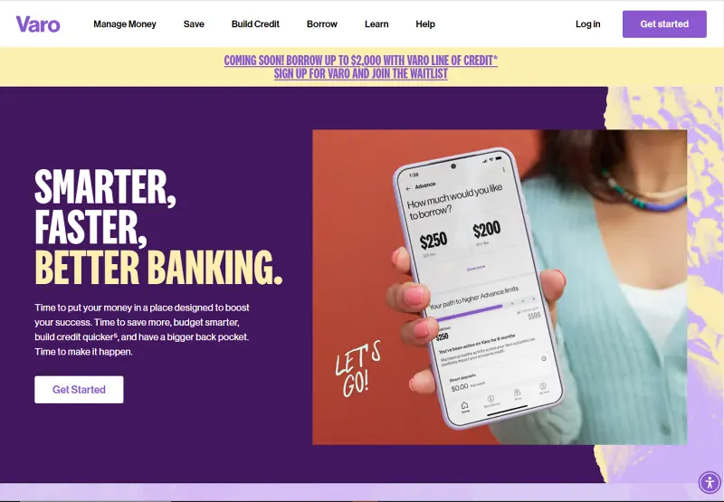
The Varo Bank website’s vibrant and youthful energy, using bold colors and dynamic imagery, stands out. A person reaching towards the sky symbolizes the limitless possibilities Varo offers with its financial services.
The tagline “SMARTER, FASTER, BETTER BANKING.” serves as a motivational call to action, accompanied by an inviting button for immediate engagement.
Varo bank
Why We Choose It:
- Inspirational Imagery
A joyful image captures the essence of financial freedom and potential. - Eye-Catching Color Scheme
Bright colors make the site memorable and visually stimulating. - Trustworthy User Reviews
Showcasing high ratings from the App Store and Google Play builds trust. - Strong Value Propositions
Benefits like “Banking with No Surprise Fees” and “High-Yield Savings” are prominently highlighted.
2. Ally Bank
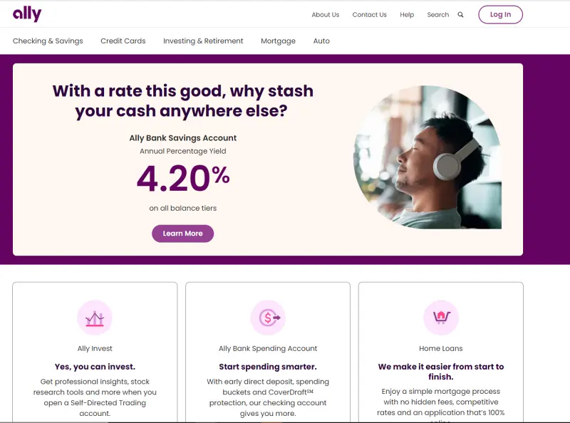
The Ally Bank website offers a cozy and welcoming aesthetic, featuring an image of a smiling couple that underscores the bank’s commitment to being a ‘financial ally.’
The headline “With a rate this good, why stash your cash anywhere else?” alongside the prominent call-to-action button “Learn more” positions Ally as a supportive partner in significant financial decisions.
Ally bank
Why We Choose It:
- Inviting and Relatable Imagery
The photo conveys trust and relatability, aligning with personal financial goals. - Highlighted Financial Offers
It features low-down payment options for home buyers as a headline offer. - Effective Call-to-Action
Encouraging immediate user engagement with the “Take the Next Step” button. - Diverse Financial Services
Sections below the main image detail various services, including investment and checking accounts, enhancing the user’s understanding of the bank’s offerings.
3. Axos Bank
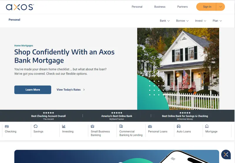
The Axos Bank website features a clean, modern design that prioritizes user experience. The main banner prominently advertises a mortgage refinance service with a clear call to action, emphasizing their commitment to straightforward financial solutions. The minimalist aesthetic, with easy-to-read fonts and a simple color scheme, effectively highlights their services and accolades.
Axos bank
Why We Choose It:
- User-Friendly Navigation
The site offers clear and concise menu options for personal, business, and partner banking services. - Appealing Visuals
The hero image features a happy couple, adding a personal touch and building trust. - Accolades Display
Showcasing awards like “Best Checking Account Overall” helps instill user confidence. - Informative Resources
The homepage provides information on various services, making it easy for users to find what they need.
Looking to Outsource Development?
Contact TECHVIFY, Vietnam’s Leading Offshore Software Development & Outsourcing Company, for a consultation and development services.
4. Alliant Credit Union
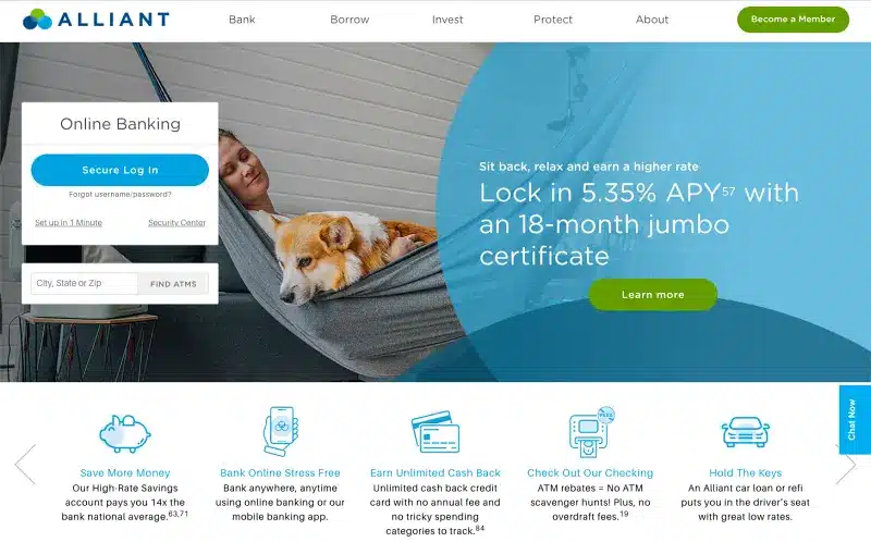
The Alliant Credit Union website portrays a sense of calm and security, essential qualities for a financial institution. The homepage is distinguished by a peaceful image of a person and a dog lounging comfortably, which, along with the overlay text, promotes a relaxed approach to earning with their financial products.
The standout offer of a 5.35% APY on an 18-month jumbo certificate is prominently featured, signaling a competitive financial advantage for potential savers.
Alliant Credit Union
Why We Choose It:
- Tranquil Visual Theme
The imagery induces a feeling of tranquility, aligning with the message of financial peace of mind. - Compelling Value Proposition
High-yield savings opportunities are highlighted to attract interest. - User-Friendly Navigation
The layout allows for easy access to key banking functions like ATM locator and secure login. - Mobile Banking Features
Emphasizing mobile banking capabilities for on-the-go account management.
5. SoFi
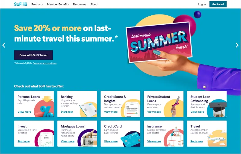
SoFi isn’t new to the scene (SoFi Stadium, for instance). The SoFi website effectively highlights its range of financial products through a colorful and organized layout. The enticing offer, “Save 20% or more on last-minute travel this summer” is prominently displayed, appealing to users interested in investment opportunities.
Services from personal loans to banking, credit score insights, and more are instantly accessible, allowing users to find and delve deeper into the details quickly. The design choice to use vibrant icons and clear typography ensures that each offering is visible and enticing.
SoFi
Why We Choose It:
- Neat and Organized Layout
The website efficiently uses screen space, with boxes aligned and spaced consistently for a clean look. - Vibrant Visuals
Icons, pictures, and colors add life to the screen while maintaining a professional tone. - User-Friendly Navigation
Buttons on each box allow users to find what they need quickly without additional searching.
6. Revolut
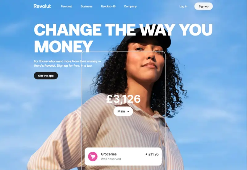
The future is going all-in on digital. The Revolut website captivates a youthful audience with its bold, contemporary design and a clear message of empowerment: “CHANGE THE WAY YOU MONEY.” The visual of a confident individual coupled with a casual, direct tone speaks to a generation that values both style and substance.
The modern look, simplicity, and call to action, “Sign up for free, in a tap,” appeal to a generation seeking instant digital gratification and control over their finances with a few smartphone taps.
Revolut
Why We Choose It:
- Strategic Use of Space
The website is well-organized with a fullscreen background image, creating a sense of depth and scale. - Seamless Responsiveness
The website is fully responsive, ensuring an excellent user experience on desktop, tablet, and mobile devices. - Engaging Text Content
Revolut’s copywriting is appealing and conveys its message effectively in a relatable tone. - Dynamic Interactive Elements
The site features interactive components, such as buttons that respond to user actions, enhancing engagement.
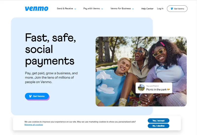
7. Venmo
Who isn’t “Venmo-ing” these days? Venmo is a widely used payment app that enables users to send and receive money from friends and family. The website highlights its unique social payments feature through an interactive feed of transactions, filled with visuals and user activity to capture interest. The design is both colorful and straightforward, making navigation and feature utilization intuitive.
Venmo
Why We Choose It:
- Social Interaction Emphasis
The design and features focus on social engagement, setting Venmo apart from other payment solutions. - Highlighting Speed and Security
The website reassures users by emphasizing the quick and secure nature of Venmo transactions. - Straightforward Navigation
A simple layout ensures users can easily find and use the app’s features. - Showcasing Mobile Experience
Screenshots of the mobile app are prominently displayed, giving users a preview of the app’s interface and functionality.
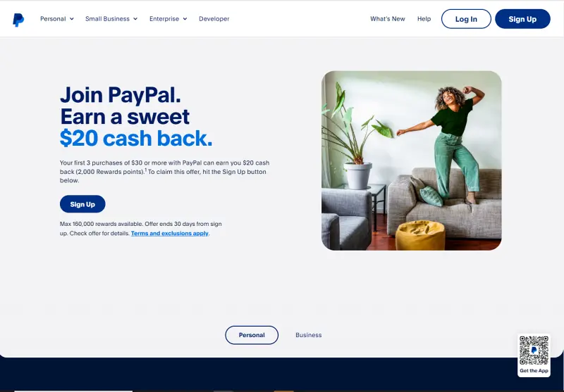
8. PayPal
PayPal, the leader in online payments, promotes its services with a clear and inviting message about earning rewards, encouraging users to “Join PayPal. Earn a sweet $20 cash back.” The website features a clean and straightforward design, with a bold header and an appealing debit card image, suggesting a smooth payment experience with the added benefit of rewards.
PayPal
Why We Choose It:
- Reputable and Trustworthy
Capitalizes on PayPal’s strong reputation for secure transactions. - Reward Incentives
Highlights the benefits of earning rewards on purchases, providing a compelling reason for users to choose PayPal. - Engaging Visuals
Presents the debit card in everyday contexts, making it more relatable and appealing. - Seamless App Integration
Includes a QR code for easy app download, reflecting a commitment to user convenience and technological innovation.
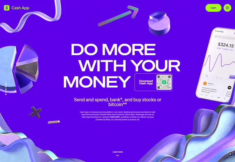
9. Cash App
Cash App, a rising competitor to Venmo, features a website that bursts with lively colors and a catchy slogan: “DO MORE WITH YOUR MONEY.” The site emphasizes the app’s diverse functionality, allowing users to handle everything from sending and spending money to banking and investing in stocks or Bitcoin. A prominently displayed QR code ensures users can easily download the app for immediate access and convenience.
CashApp
Why We Choose It:
- Vibrant and Engaging Design
The website’s energetic visuals capture the dynamic nature of Cash App’s capabilities. - Comprehensive Financial Services
The app’s multifunctionality in financial management and investment is clearly showcased. - Seamless App Download
A QR code simplifies the process of downloading the app, enabling quick user action. - Clear and Direct Messaging
The website succinctly conveys the app’s primary services, emphasizing financial empowerment for users.
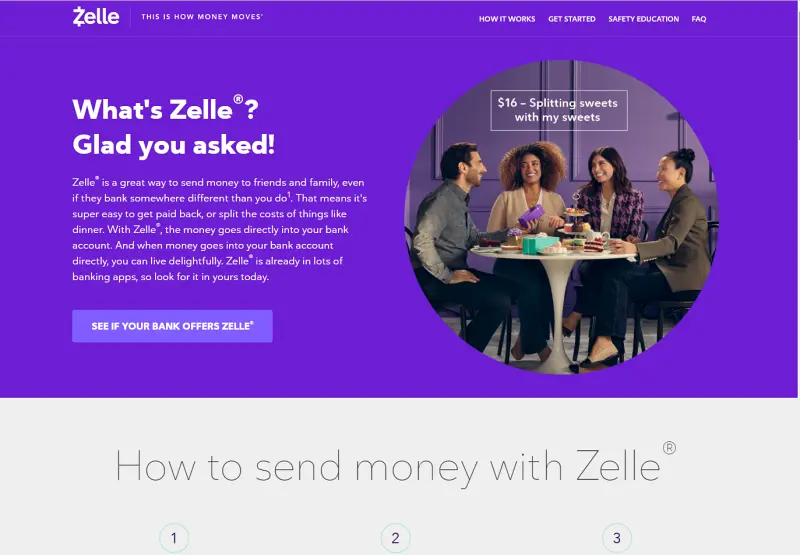
10. Zelle
Zelle’s website welcomes visitors with a warm and informative tone, promptly addressing the question, “What’s Zelle?” The site elaborates on how Zelle is a convenient method for sending money, emphasizing its ease of use in various scenarios such as splitting costs with friends or family. It highlights the service’s integration within many banking apps, fostering a sense of familiarity and trust.
Zelle
Why We Choose It:
- Conversational Tone
Engages visitors through a question-and-answer format, making the information feel more approachable and relatable. - Sociable Imagery
Photos of people enjoying each other’s company while using Zelle® illustrate the app’s role in everyday social interactions. - Seamless Bank Integration
Highlights how Zelle® is incorporated into existing banking apps, promoting ease of adoption and use. - Effective Call-to-Action
The “SEE IF YOUR BANK OFFERS ZELLE®” button encourages users to check for compatibility immediately, driving engagement.
III. Advanced Tips for Better FinTech Website Design
Integrate Advanced Security Features
Beyond standard SSL certificates, implement multi-factor authentication (MFA) to add an extra layer of security: Encrypt data storage and transmission to protect sensitive information. Regularly perform security audits and vulnerability assessments to stay ahead of potential threats.
Personalize User Experience with Data
Utilize machine learning algorithms to analyze user behavior and preferences, offering tailored financial advice or product recommendations. Implement dynamic content that changes based on user data, such as personalized dashboards or investment insights, to make the user experience more relevant and engaging.
Leverage AI and Chatbots
Integrate AI-driven chatbots to provide instant customer support and handle routine inquiries efficiently. Natural language processing (NLP) facilitates more intuitive and human-like interactions. AI can also assist with fraud detection by analyzing transaction patterns in real-time, enhancing security.
Implement Progressive Web App (PWA) Features
Transform your FinTech site into a Progressive Web App to offer a more seamless user experience. PWAs provide benefits like offline access, faster load times, and push notifications, which can significantly enhance user engagement and retention. This approach ensures your platform remains accessible and functional even under suboptimal network conditions.
Employ Micro-Interactions and Animations
Incorporate micro-interactions and subtle animations to enhance user engagement and provide feedback. These small design elements can guide users through processes, highlight important actions, and make the overall experience more enjoyable. Ensure that animations are smooth and do not hinder the site’s performance.
Conclusion
The fintech industry is rapidly evolving, with digital banking, money transfer services, and investment platforms becoming essential. A strong online presence is crucial for attracting and retaining customers. The best fintech website design of 2024 shows the importance of user-centric design, advanced security, and innovative features.
Fintech companies must prioritize their website design and continuously adapt to new technologies and user expectations to stay competitive.
Ready to dominate the fintech scene? Contact TECHVIFY now for unparalleled consultancy and cutting-edge fintech app development. Transform your digital presence with our expert team and stay ahead in the fintech revolution!
TECHVIFY – Global AI & Software Solution Company
From Startups to Industry Leaders: TECHVIFY prioritizes results, not just deliverables. Accelerate your time to market and see ROI early with high-performing teams, AI (including GenAI) Software Solutions, and ODC (Offshore Development Center) services.
- Email: [email protected]
- Phone: (+84)24.77762.666


